
By Azabache Producciones on
Modular office signs avoid full remakes: Braille requires validation of every piece
A guide to identifying rooms and offices with updateable parts, clear reading, suitable materials, and well-planned installation.
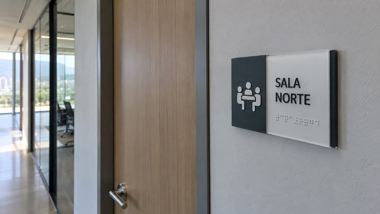
An office sign performs a task that only appears simple: it must help people find a room, confirm they have reached the right place, and remain useful when the name or use of the space changes. A modular system handles those changes by allowing the content to be replaced without remaking the entire sign.
Accessibility cannot be added at the end as an accessory. Contrast, height, relief, Braille, and the relationship with other signs must be defined during design; for state entities, Law 2265 of 2022 also requires Braille signage in common areas and sets July 1, 2027, as the date its provisions take effect.
It therefore makes sense to buy a system instead of a collection of unrelated signs. Before requesting a quote, inventory the spaces, separate permanent content from information that changes, and agree on how the signs will be produced, installed, and replaced.
Which office plaques work best as signs?
The best signs maintain a consistent visual family, can be read along the approach route, and support the level of updating the space requires. If names, teams, or uses change frequently, a permanent base with replaceable content avoids manufacturing the entire sign again.
A stable office can use a one-piece sign. Modular identification systems maintain a common structure while allowing content changes; they suit a coworking space, shared practice, or facility with rotating departments, provided the mechanism remains secure and does not look temporary.
The decision also depends on cleaning, impacts, indoor humidity, sunlight exposure, and reading distance. The substrate, meaning the base material that receives the print, must suit the actual environment and the intended fastening method.
Are crystal-style signs suitable for offices and practices?
A crystal appearance can be attractive, but the offered material must be confirmed first. Acrylic, PVC, and glass are not equivalent: their weight, rigidity, impact behavior, edge finish, installation, and maintenance differ. The choice should respond to the space, not only to a reference photograph.
If a quote says “crystal,” ask for the material, thickness, finish, anchoring system, and replacement method in writing. Interior and safety signage solutions in Medellín can be designed in acrylic or PVC according to the project's conditions.
It is also worth requesting a physical sample when corporate color, transparency, or legibility against the wall is critical. A transparent surface can lose contrast when grain, shadows, reflections, or paint changes appear behind it.

Acrylic and PVC sign samples with inserts and mounting systems. Illustrative image generated with artificial intelligence.
What should signs used to identify offices include?
They should include only the information needed to recognize the space: the room or department name, a number when it belongs to the system, and an understandable pictogram when it supports wayfinding. Text, symbols, contrast, relief, and Braille should work as complementary resources, not as competing layers.
Recent institutional practice in Colombia reinforces this multi-format approach. The Citizen Service Manual of Bogotá's District Secretariat for Economic Development calls for visible, simple, sufficient signage complemented by graphic symbols, relief, and Braille within its district scope.
Not every private office is covered by the cited Law 2265 obligation: its provision for common areas expressly refers to state entities. For any public or private project, define the applicable Colombian requirements with the technical lead and include that validation within the contracted scope.
How should identification signs for offices be selected?
Start with the inventory, not the material: record every door, wall, intersection, and destination, noting which content will remain and which will change. This map makes it possible to standardize sizes, hierarchies, and spare parts, while separating identification signs from directional and warning signs.
- Content: current name, pictogram, numbering, required relief or Braille, and the person responsible for approval.
- Environment: mounting surface, light, reflections, humidity, cleaning, foreseeable impacts, and reading distance.
- Changes: update frequency, replaceable parts, master artwork, and a reasonable quantity of spares.
- Procurement: sample, technical data sheet, color proof, installation method, written lead time, and acceptance criteria.
There is no standard comparable price or lead time per sign. The quote changes with quantity, dimensions, material, finish, personalization, Braille, installation, and urgency, so it should detail each variable and clarify which artwork adjustments, proofs, transportation, and installation are included.
If sustainability is part of the purchase, the word “recyclable” is not enough. Request composition, documented recovered-content percentage, local availability, traceability, and an end-of-life plan. Take-back programs depend on the supplier and the market where it operates.
How should signs for office doors be installed?
Installation should be defined after walking the user's route and inspecting the actual mounting surface. Location, height, approach side, and fastening must be repeated consistently, without interfering with handles, frames, door movement, equipment, or circulation. This consistency also helps visitors recognize the signs as one system.
A full-size test makes it possible to review legibility, contrast, reflections, and tactile reach before producing the full series. On transparent doors or partitions, the sign must retain contrast against a changing background and coordinate with the visual elements that make the glass perceptible.
Adhesives can simplify installation on compatible surfaces; standoffs or mechanical anchors require drilling and a more careful wall assessment. The supplier should specify surface preparation, fastening, tolerances, and the replacement procedure, and provide the installation lead time in writing.
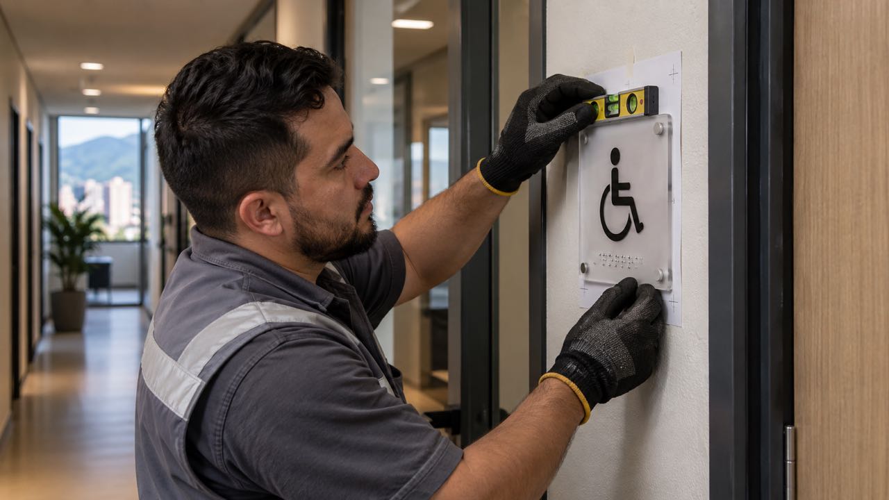
Technician aligns a tactile sign beside an office door frame. Illustrative image generated with artificial intelligence.
How should signs with office names be designed?
First design a template with clear hierarchies and test it with the shortest and longest names in the inventory. The sign must retain its type size, contrast, and order as content changes; shrinking individual texts case by case breaks consistency and hinders reading.
Flatbed UV printing can form Braille dots through successive ink layers on rigid materials. The technical workflow documented by Roland demonstrates this capability, but the technique alone does not establish compliance: every file, relief, and finished piece must be validated against the applicable Colombian requirements.
Close the project with a master file, version naming, and rules for future additions and removals. A sound handoff includes the location matrix, approved artwork, specifications, and replacement criteria, so the next name change preserves the system instead of starting another one.